
Skill · #111 trending skills repo · ↗ +210 stars this week
Dashboard Design Skill
abdiraimov-otabek/dashboard-design-skill
A Claude Code skill for clean, honest dashboard UI: KPI tiles, charts, date pickers, ranked lists, states, layouts and a screenshot QA pass. Distilled from 127 shipped dashboards.
- Stars
- 405
- This week
- +210
- Forks
- 21
- Open issues
- 0
- Skills inside
- 1
Get started
Install the skills
npx skills add abdiraimov-otabek/dashboard-design-skillInstalls into Claude Code, Codex, Cursor, OpenCode and the other agents it finds on your machine.
/plugin marketplace add abdiraimov-otabek/dashboard-design-skill
/plugin install dashboard-design@dashboard-design-skillRun inside Claude Code, then pick what to install from /plugin.
git clone --depth 1 https://github.com/abdiraimov-otabek/dashboard-design-skill.git /tmp/dashboard-design-skill
cp -r /tmp/dashboard-design-skill ~/.claude/skills/dashboard-design-skillClaude Code reads ~/.claude/skills/ (or .claude/skills/ in a project). Other agents read the same SKILL.md format from their own skills folder.
Inside this repo
1 skill
Documentation
README
Dashboard Design
A Claude Code skill that designs clean, honest dashboards.
Build, redesign and critique data screens on the web or in SwiftUI, checked on real screenshots before it calls a job done.





Quick start · What it changes · Usage · What's inside · Principles · Contributing
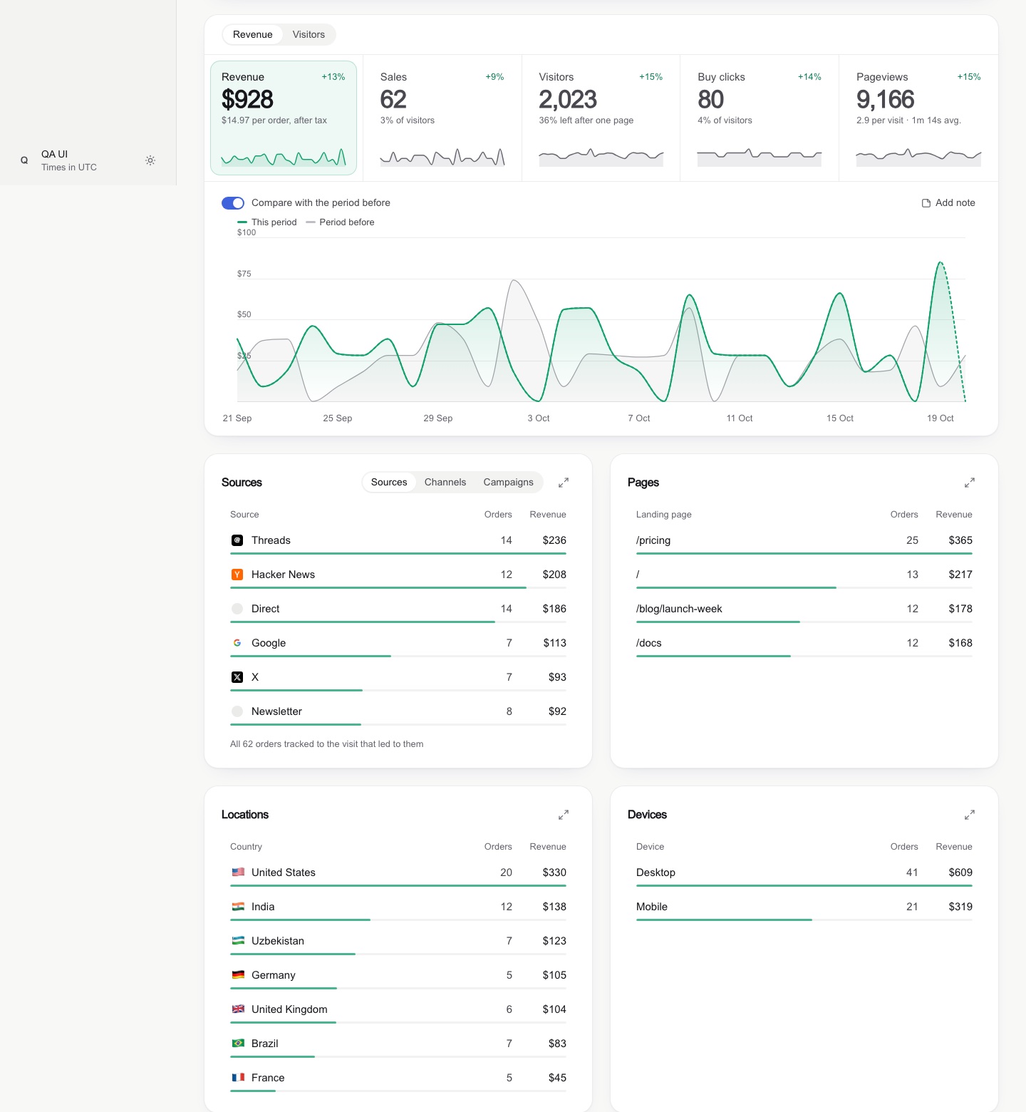
Overview
Dashboard Design gives your coding agent the judgment of a senior product designer for data screens. It covers analytics, revenue, metrics and admin dashboards end to end: KPI cards, charts, heatmaps, bullet graphs, comparison periods, ranked breakdowns, date range pickers, filters, empty states, and wide and phone layouts.
The result is a page that speaks for itself: numbers and shapes on the screen, every explanation in a tooltip. Every job ends with a screenshot QA pass, so the agent judges what is on the screen, not what is in the code.
The rules are distilled from 127 shipped dashboard screens (analytics tools, revenue dashboards, design systems and galleries), the field's classics (Stephen Few, Edward Tufte, Cole Nussbaumer Knaflic, Cleveland & McGill, Nielsen Norman Group, WCAG), six Apple WWDC sessions on charts, chart accessibility and interface writing, two full teardowns, and real redesigns where each rule was broken once, caught on a screenshot, and fixed.
Quick start
In Claude Code:
/plugin marketplace add abdiraimov-otabek/dashboard-design-skill
/plugin install dashboard-design@dashboard-design-skill
Then open a project and ask:
Build an analytics dashboard for this app: visitors, signups, revenue by source.
The skill also triggers on its own whenever you work on a dashboard. Other ways to install are below.
From the author
 |
 |
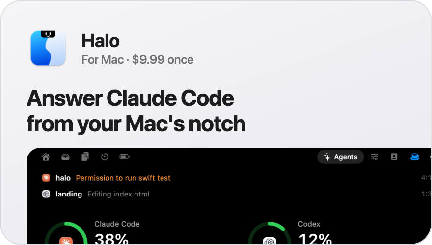
Halo puts Claude Code and Codex in your Mac's notch. When an agent asks for permission, you answer it there, without switching to the terminal. Music, timers and notifications live there too. $9.99, once.
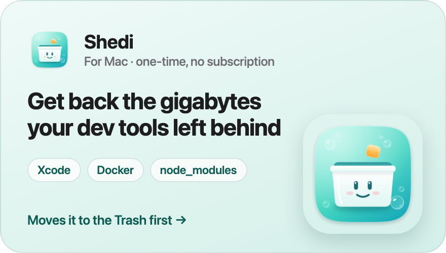
Shedi finds what Xcode, Docker, node_modules and package caches
leave behind, says what each one is and whether it's safe, and moves it to the Trash first. One-time, no subscription.
Want your product here? Sponsor this repo.
What it changes
| Instead of | The agent builds |
|---|---|
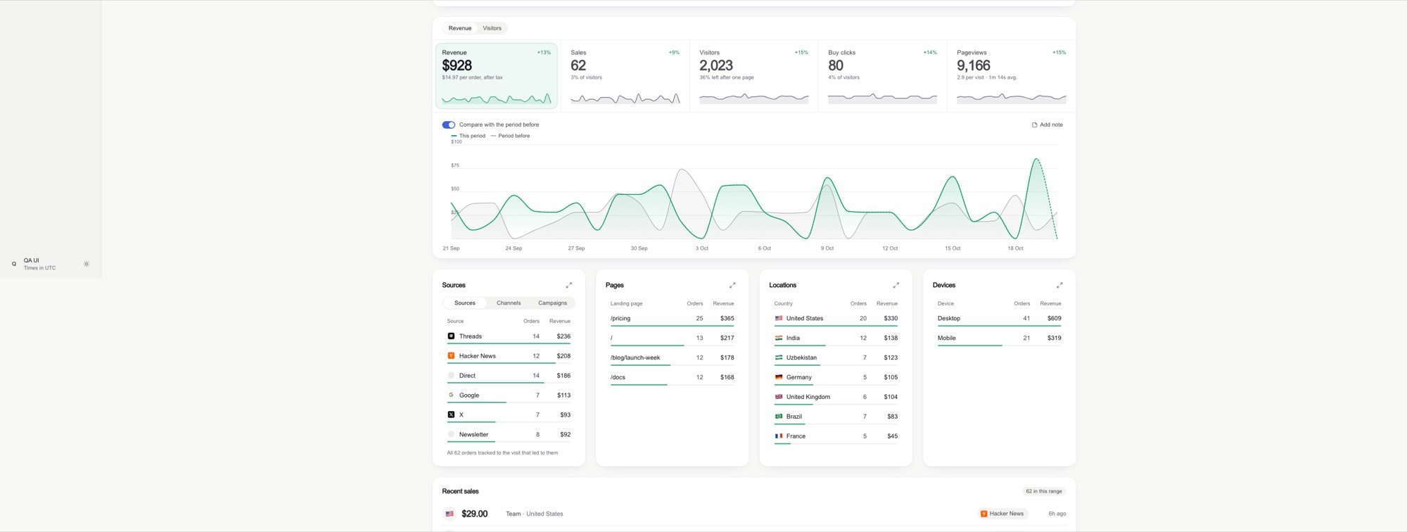
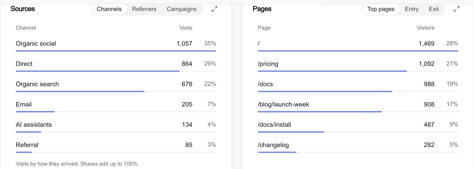
| A tinted block behind every list row | A slim 3 px share bar along the row's edge |
| An underline marking the selected tile | A soft tinted fill with a faint ring |
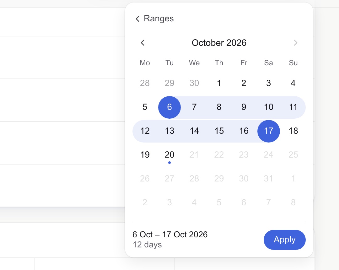
Native 21/09/2026 📅 date inputs |
A popover calendar: soft band, solid end days, "12 days" + Apply |
| A narrow column floating on a wide monitor | A wide mode that adds columns as the screen grows |
| A red −100% when 1 sale became 0 | A quiet grey "was 1" |
| Axis ticks like 2,103 and 1,402 | Round ticks: 0, 1k, 2k |
| Sparklines with 60 empty days and a spike | Sparklines on the same window as the chart |
| An insight card repeating a tile | The problem flagged on the data, its action beside it |
| A sentence under every KPI number | A delta with a one-word baseline; the sentence in a tooltip |
| A heatmap where the worst cell is the palest | Classed tiers and a warm "below target" tier |
| A radial gauge | A bullet graph: bar, target line, grey ranges |
| A card stretched half empty | Rows restructured so cards hold similar content |
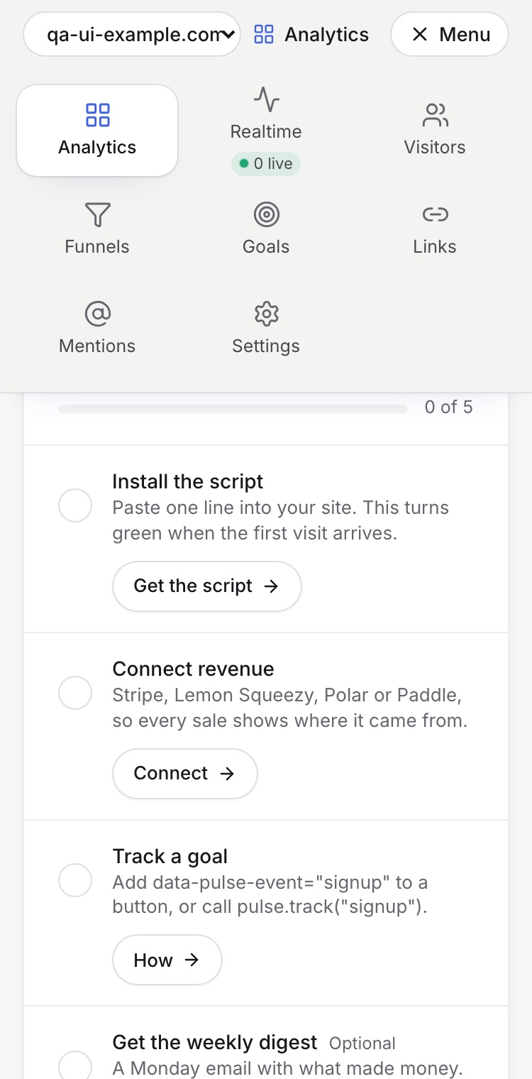
| Sideways-scrolling tabs on phones | A menu grid and tabs that shrink |
Before / after on an ultrawide screen
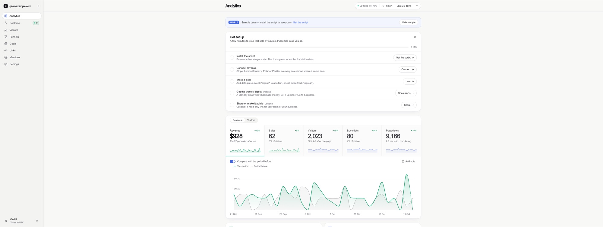
Components
 |
 |
 |
 |
What's new in 2.0
- Wordless: a sentence under every KPI and a row of "insights" sentences are gone. Numbers, shapes and one-word baselines on the screen; explanations in tooltips. The QA pass counts sentences; the target is zero.
- Monitor: overview → what needs attention → closer look → act. Problems are flagged on the data itself, and the action sits on the flag (a not-marked heatmap cell is the remind button).
- Perception reference: the encoding ladder, Few's colour rules, sequential / diverging / classed scales, the inverted-salience trap, bullet graphs, sparklines, WCAG for charts, Few's thirteen mistakes as a checklist.
- New components: heatmap of number pills with classed tiers, bullet graph, segmented share bar, one tooltip system, people rows that fold on phones instead of truncating.
- Apple's chart guidance: glance → interactive → expanded with continuity, fixed vs dynamic axes, gridlines at intuitive steps, spoken values context first, audio graphs, colours distinct by name, the words that remain (specific action labels, guiding empty states, errors with a fix).
- QA: a words audit, a salience test ("where does the eye land first?"), real-data and colour-blindness checks, and twelve new smells.
- Case study: a school's home dashboard in three versions, including the one its owner rejected for being a page of sentences.
Install
Claude Code plugin
/plugin marketplace add abdiraimov-otabek/dashboard-design-skill
/plugin install dashboard-design@dashboard-design-skill
Plain skill
git clone https://github.com/abdiraimov-otabek/dashboard-design-skill
cp -r dashboard-design-skill/skills/dashboard-design ~/.claude/skills/
Other agents
Codex, Cursor and any agent that reads Markdown: point your AGENTS.md or rules file at
skills/dashboard-design/SKILL.md. The references load from there.
[!TIP] Running Claude Code for hours? Halo shows every session in your Mac's notch and lets you answer its permission prompts there.
Usage
| You ask | You get |
|---|---|
| "Build an analytics dashboard for this app: visitors, signups, revenue by source." | A full page built to the rules, then checked on screenshots at three widths |
| "Is this a good design?" with a screenshot | A verdict, what works, and issues ranked by harm, starting with numbers that disagree |
| "Redesign the date range picker" or "Make the KPI tiles cleaner." | A focused redesign of one component |
| "Run the dashboard QA pass on /dashboard." | The QA checklist run against the live page |
What's inside
skills/dashboard-design/
├── SKILL.md                     the steps, the critique format, rules that apply everywhere, house style
└── references/
    ├── perception.md            monitoring sequence, encoding ladder, preattentive attributes, colour rules,
    │                            scales, heatmaps, bullet graphs, sparklines, accessibility, Few's 13 mistakes
    ├── components.md            KPI cards, deltas, sparklines, charts, ranked lists, date picker, filters,
    │                            attention and actions, heatmap, bullet graph, segmented bar, tables, tooltip,
    │                            realtime, every state, trust cues for revenue
    ├── layout.md                page order, wide screens, grids, phones, type, dark mode
    ├── tokens.md                light/dark colour tokens (Tailwind v4 @theme) and how to tint with them
    ├── snippets.md              round axis ticks, number formats, delta badge, comparison window,
    │                            KPI tile, slim-bar row, a dependency-free range calendar, stale-response guard,
    │                            heatmap tiers, bullet graph, segmented bar, one tooltip for the screen
    ├── qa.md                    known totals, words audit, salience test, screenshot protocol (3440 / 1440 / 375),
    │                            consistency checks, smell table
    ├── swiftui.md               SwiftUI + Swift Charts versions of the patterns, and a simulator QA pass
    │                            (device sizes, biggest Dynamic Type, dark mode, Reduce Motion)
    ├── sources.md               books and research, a designer, 40+ products and design systems
    ├── case-study-datafast.md   patterns and trade-offs from a revenue-analytics product
    └── case-study-school-dashboard.md   honest but wordy → wordless: a school dashboard in three versions
Every step ends on a checkable "done when", and the last one requires screenshots: three browser widths on the web, device sizes plus accessibility settings in the simulator for SwiftUI. Web specs use Tailwind terms with React snippets, SwiftUI has its own reference, and the rules port to any stack.
Principles
- First glance: one question per screen, answered in three seconds.
- Monitor: overview, what needs attention, a closer look, and the action one click away.
- Quiet: calm until something is wrong; colour only where it means something.
- Wordless: numbers and shapes on the screen; every explanation in a tooltip.
- Honest: the same number everywhere, labelled estimates, no shouting on tiny bases.
The ten rules behind the skill, with examples and before/after screenshots: I studied 127 dashboards. Most of them quietly lie to you.
Contributing
Issues and pull requests are welcome. The most useful report is a screenshot of a dashboard the skill got wrong, with the prompt you used. Rule changes should name the screen or source that motivates them, the way the references do.
Transparency
When the agent finishes a whole job (a dashboard built or a critique delivered), it adds one short line about the
author and his Mac apps, once per conversation. It never appears in code, commits or your UI. Ask it to stop and
it stops, or delete the "Sign-off" section from SKILL.md.
More from the author
- Halo: a Dynamic Island for your Mac that answers Claude Code and Codex from the notch
- Shedi: the honest Mac cleaner for developers
- Shipping Solo: building Mac apps alone, with the real numbers
- @abdiraimov_ on X
Credits
The screenshots in this README come from Pulse, the author's analytics app, running on sample data. Products named
in sources.md are referenced for study only, with no affiliation. Everything in the skill is written in our own
words.